HollandGreen
01.
The Brief
We first partnered with award-winning architects HollandGreen in 2017, transforming their online presence to attract a higher income client and project. We’re proud to say we succeeded and contributed to their exceptional growth!.
Since then, their business evolved into a multi-disciplinary practice that also specialises in Interior Design and Landscape Design. They were in need of a website that reflects their new areas of expertise.
This time, we were tasked with bringing all these HollandGreen brands under one roof into a holistic platform that allows cross-referencing projects across all the disciplines. Once again, we made sure it has the style and finesse to elevate their presence to secure even bigger projects than ever before.
INDUSTRY
Architecture
LOCATION
UK
INVOLVEMENT
Web Design
Web Development

02.
The Challenge
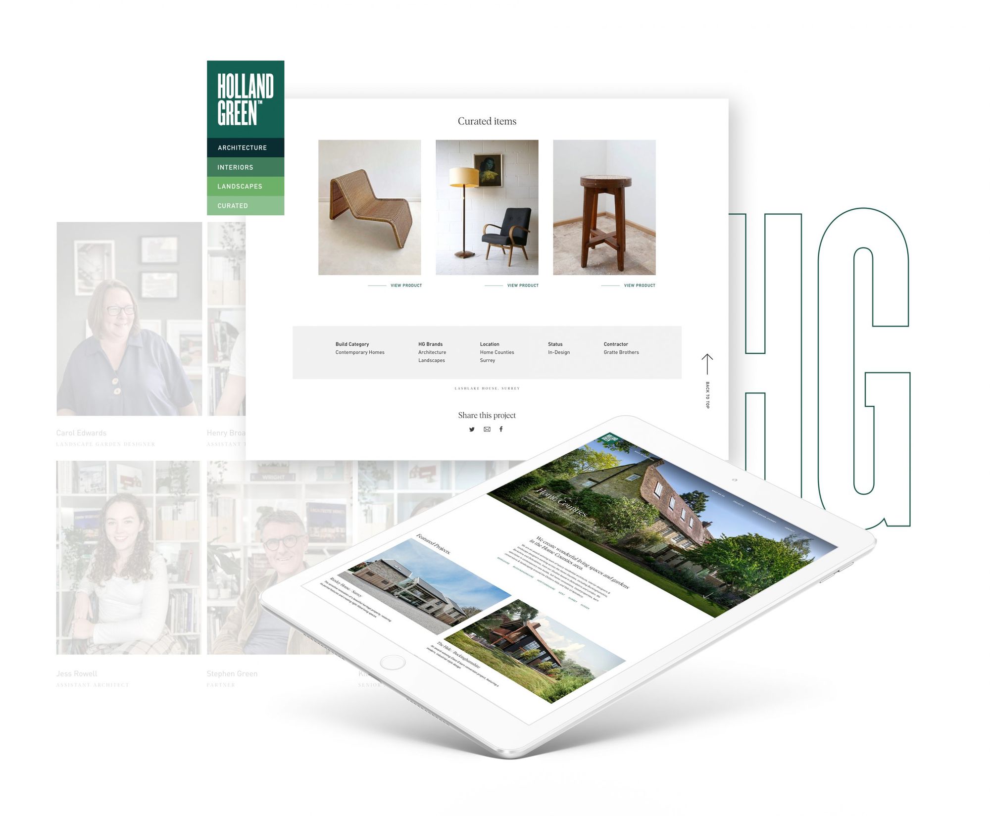
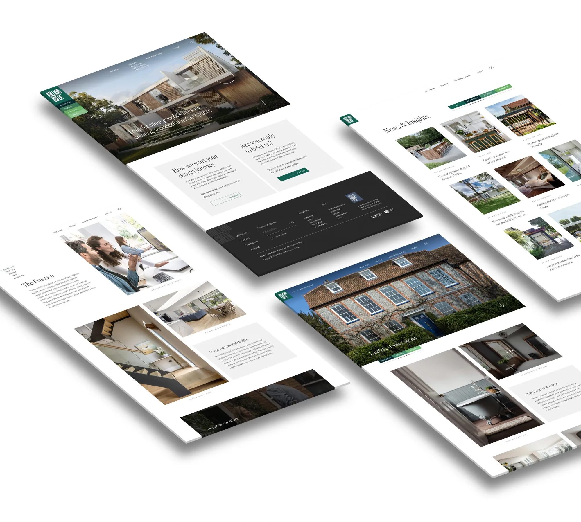
HollandGreen had evolved their branding to include Architecture, Interiors, Landscapes, and Curated (an E-commerce site to purchase items used in projects) into a system of logos and signifying brand colours. From planning discussions, it was clear that this signposting should be emulated across the website to indicate which HG brand had been involved in each project. We also utilised it for insights, articles and process flows.
We simplified the taxonomy and UX structure to showcase each business area more effectively. Some projects have to highlight the work of all three HG brands that had worked across it, whereas other projects are solely presenting the work of one HG brand. By doing so, we steered away from duplicate project pages, and encouraged users to browse through projects seamlessly, seeing how each brand contributed to them.
We also gave each HG brand its own landing page with info, articles, and featured projects with changeable thumbnails, allowing HG to adapt them to different user journeys.
The individual project pages feature a filter tab system based on the brand colours, allowing users to toggle between the disciplines. It loads up specific content including headers, images and descriptive information. This taxonomy was also brought across the news section so articles can be linked seamlessly.
03.
Features
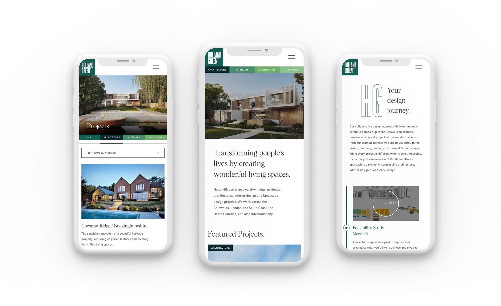
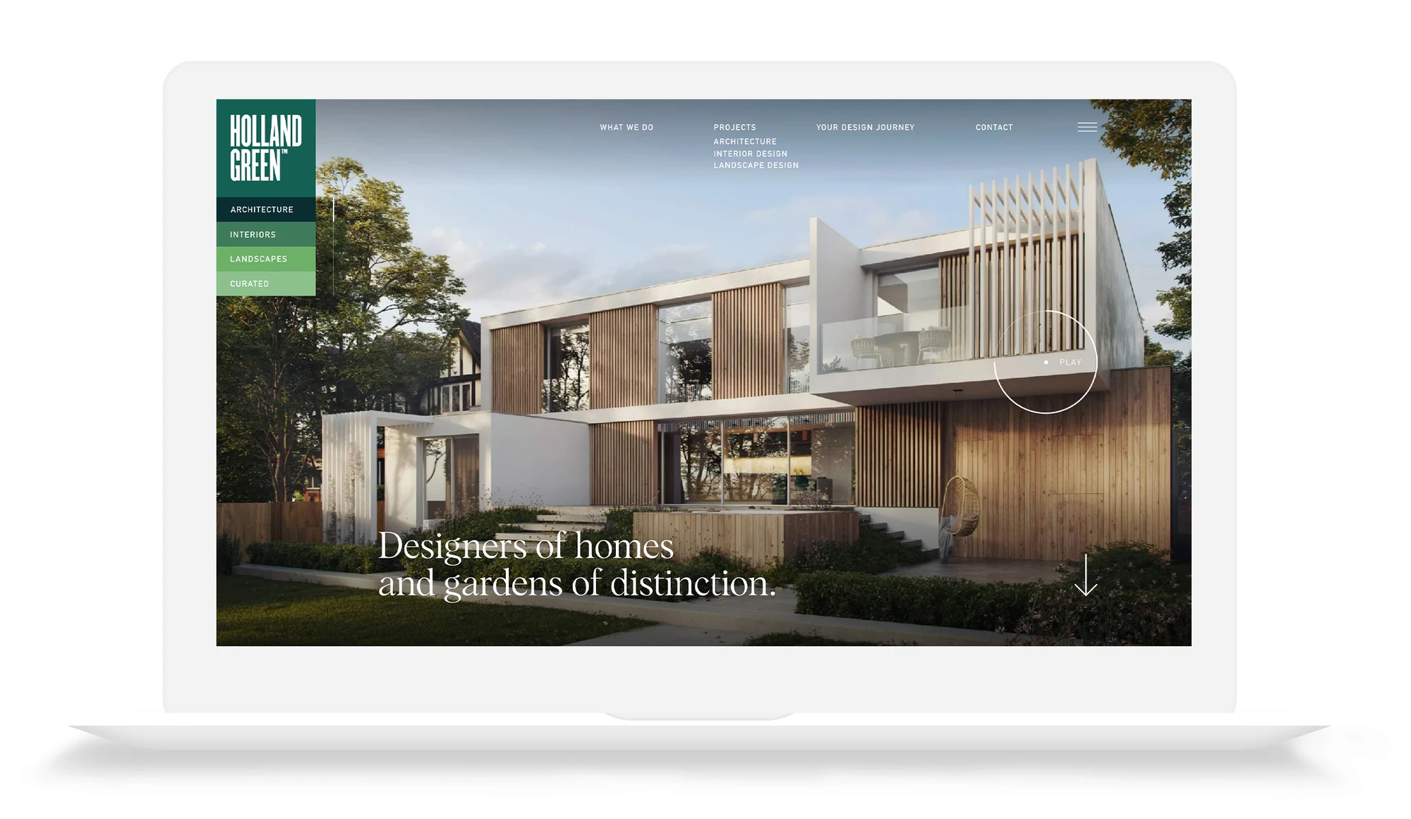
The homepage of the website centres around an elegant slider concept, featuring videos for each HG brand, creating an aspirational and thoughtful experience. We used the HG logo as a navigation signpost for each slider, with relevant content and full sound video options.
Other key features include multi-component layouts for project pages and bespoke briefing questionnaire journeys for each of the HG brands.
We also created a fully editable ‘design journey’ (process) component with a timeline. This component highlights the time frames of a project across all the disciplines, and how they connect, giving information via video snippets. The journeys are flexible, allowing the client to adapt them in the future.
Although functionality-wise, this project was complicated in terms of thinking and processing, the front end solution is minimal and elegant in aesthetic. We’re proud to say we succeeded in simplifying all of the business needs into one holistic website!
